Updated on Kisan Patel
This tutorial will explain you learn how to work with DockPanel control in WPF application?
The DockPanel control defines an area where you can arrange the child elements either vertically or horizontally.
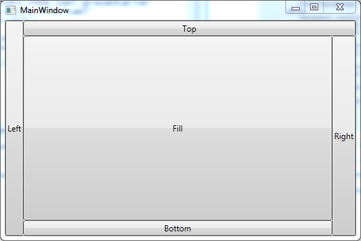
Lets create a WPF application and name it “WPFDockPanelDemo” and add the DockPanel control to the MainWindow.xaml file as shown in below code.
<Window x:Class="WPFDockPanel.MainWindow"
      xmlns="http://schemas.microsoft.com/winfx/2006/xaml/presentation"
      xmlns:x="http://schemas.microsoft.com/winfx/2006/xaml"
      Title="MainWindow" Height="350" Width="525">
      <DockPanel>
         <Button Content="Left" DockPanel.Dock="Left"/>
         <Button Content="Top" DockPanel.Dock="Top"/>
         <Button Content="Right" DockPanel.Dock="Right"/>
         <Button Content="Bottom" DockPanel.Dock="Bottom"/>
         <Button Content="Fill"/>
      </DockPanel>
</Window>
In above code, you can see a simple UI is created using the DockPanel control. You can determine the position of the child elements in the DockPanel control by using DockPanel.Dock dependency property. You can set the value of the DockPanel.Dock property to Top, Right, Left or Bottom to position the child elements in the DockPanel control.

By default, the child elements in the DockPanel control of the same size. If you want to change the size of the child elements, you can set the size by using the Height and Width attributes of the child element.
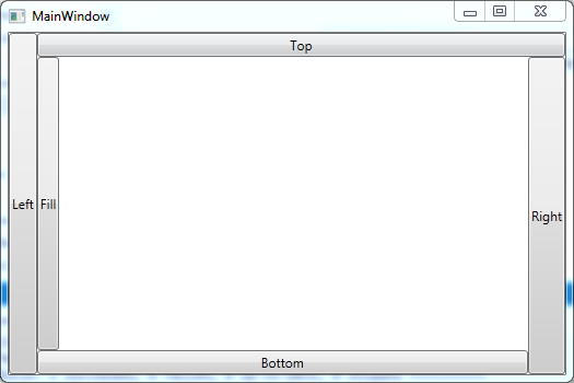
The LastChildFill property is the default value that stretches to fill the remaining space of the DockPanel control. You can override the default value by setting the LastChildFill = "False" property.
<DockPanel LastChildFill="False">
      <Button Content="Left" DockPanel.Dock="Left"/>
      <Button Content="Top" DockPanel.Dock="Top"/>
      <Button Content="Right" DockPanel.Dock="Right"/>
      <Button Content="Bottom" DockPanel.Dock="Bottom"/>
      <Button Content="Fill"/>
</DockPanel>
