Updated on Kisan Patel
In this tutorial, you learn how to working with Rows and Columns for Grid using XAML in WPF application.
By default the Grid element is added to WPF applications. The Grid element by default has only one cell, that is one row and one column.
If you want to vertically increase the number of cells in the Grid, then you need to add more rows in the Grid element.
For Example,
<Grid>
   < <Grid.RowDefinitions>
     <RowDefinition Height="40"></RowDefinition>
     <RowDefinition Height="50"></RowDefinition>
     <RowDefinition Height="40"></RowDefinition>
     <RowDefinition Height="50*"></RowDefinition>
   </Grid.RowDefinitions>
</Grid>
Similarly, to increase the numeber of cells horizontally in the Grid element, you need to add more columns. In this way, every row can have multiple columns.
For Example,
<Grid>
   <Grid.RowDefinitions>
      <RowDefinition Height="40"></RowDefinition>
      <RowDefinition Height="50"></RowDefinition>
      <RowDefinition Height="40"></RowDefinition>
      <RowDefinition Height="50*"></RowDefinition>
   </Grid.RowDefinitions>
   <Grid.ColumnDefinitions>
      <ColumnDefinition Width="40"></ColumnDefinition>
      <ColumnDefinition Width="50"></ColumnDefinition>
      <ColumnDefinition Width="40"></ColumnDefinition>
      <ColumnDefinition Width="50*"></ColumnDefinition>
   </Grid.ColumnDefinitions>
</Grid>
In above code, the Width of the first, second and third ColumnDefinition elements is 40, 50, 40 pixels respectively. However the fourth column is set to 50*, where the asterisk indicates the percentage of the remaining space in the Grid.
Although, the Design view immediately displays the rows and columns that you have added through the XAML code.

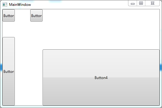
Let’s add four button controls.
<Grid>
   <Grid.RowDefinitions>
      <RowDefinition Height="40"></RowDefinition>
      <RowDefinition Height="50"></RowDefinition>
      <RowDefinition Height="40"></RowDefinition>
      <RowDefinition Height="50*"></RowDefinition>
   </Grid.RowDefinitions>
   <Grid.ColumnDefinitions>
      <ColumnDefinition Width="40"></ColumnDefinition>
      <ColumnDefinition Width="50"></ColumnDefinition>
      <ColumnDefinition Width="40"></ColumnDefinition>
      <ColumnDefinition Width="50*"></ColumnDefinition>
   </Grid.ColumnDefinitions>
    <Button Name="Button1" Content="Button1" Grid.Row="0" Grid.Column="0"/>
    <Button Name="Button2" Content="Button2" Grid.Row="2" Grid.Column="0" Grid.RowSpan="2"/>
    <Button Name="Button3" Content="Button3" Grid.Row="0" Grid.Column="2"/>
    <Button Name="Button4" Content="Button4" Grid.Row="3" Grid.Column="4"/>
</Grid>
In above code, you can see we have set button element appears in the row and column by setting the Grid.Row and Grid.Column attributes. Here, we have set Grid.RowSpan attribute is set to 2 for Button2, which implies that Button2 spans two rows.
The following output displayed when you run the WPF application.